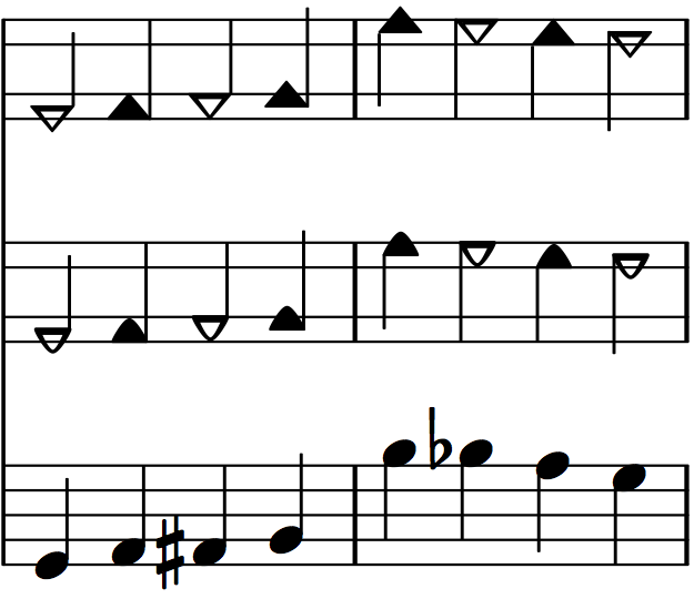
While working on LilyPond Templates for TwinNote I revised the note head shapes to make them more aesthetically pleasing and easier to read. Here is a “close-up” illustration comparing the previous straight triangle shapes (top), the new rounded triangle shapes (middle), and traditional oval notes (bottom).

Think of these revised shapes as a different note head “font” for TwinNote. (They are not actually part of a font file, but are defined directly as custom “stencils” with LilyPond using cubic bezier curves.)
The width of the new note heads is basically the same as the traditional oval notes (they are actually just a smidgen wider) while the older triangle shapes are noticeably wider. The reason the older triangle shapes were wider was to make their visual appearance, in terms of their overall size and weight relative to the staff, comparable to that of traditional note heads. (Triangles have less surface area than ovals if you confine them to the same rectangular box.) Otherwise you would have to scale the staff up to a larger size for the note heads to be just as easy to see and discern.
The new shapes overcome this problem through their curved shape, allowing them to have both a similar width as traditional oval note heads and a similar overall size and weight relative to the staff. Their width and shape provides a better sense of proportion, spacing, and separation between notes. This is especially the case for chords and intervals with notes on both sides of the stem (where the extra width of the older triangle note heads was especially apparent).
To point out a few other improvements, the visual prominence or “weight” of the hollow or white notes better matches that of the solid notes, since they are drawn with a heavier or thicker line. Also the point where the stems attach to the note does not appear as narrow or “fragile” as with the straight triangles.
Overall I think the rounded shapes are a nice improvement — more graceful, refined, aesthetically pleasing, and easier to read.
Pingback: LilyPond, Key Signatures, Accidental Signs, Etc. | Blog | TwinNote Music Notation
Pingback: SVG Images, Rests, LilyPond 2.17 | Blog | TwinNote Music Notation
Pingback: (Another) New Revised Note Head Style | Blog | TwinNote Music Notation